Zack galifianakis
|
|
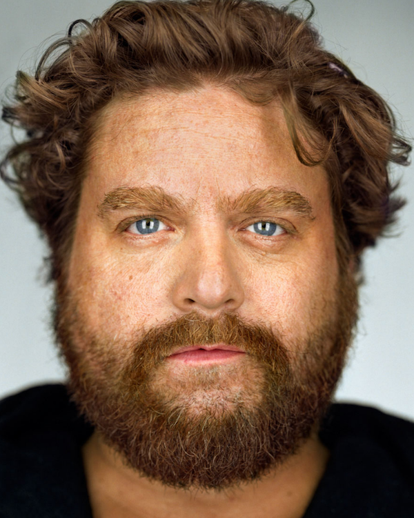
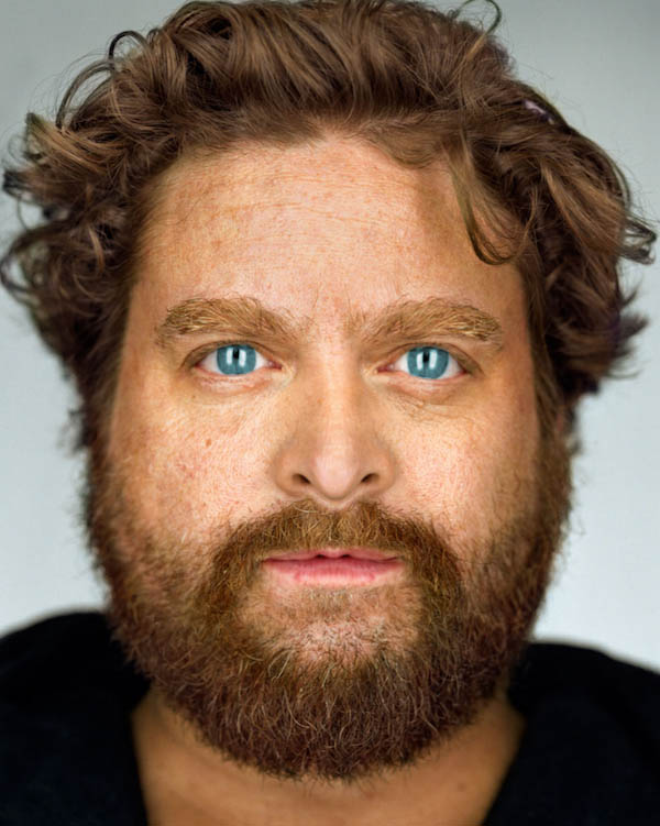
Before we even started to edit this man we thought about what we wanted to do. We figured we didn't want to change him drastically so we wanted to match the symmetry of the left side of his face with the right side. We began by opening up his eye a little more open like his other eye is and by trying to make them the same size. We then stretched the bottom of his lip a little more down so its as plump as the left side is. We then looked at what else we could do to edit his face and we just edited his nose more by stretching the tip of his nose down and flaring both of his nostrils up and out. We noticed that there was a unnatural shine on his nose and we then used the patching tools to add more rough and freckle skin on the shiny part. We then wanted to edit his eyes so that they could pop out more. I selected the colour out of the eye including the pupils and added a higher saturation and brightened the eyes up more to make the blue more intense. If I were to edit this picture one more time I would try to make the eyes have a more natural colour and make the nose less pointed and more natural.
original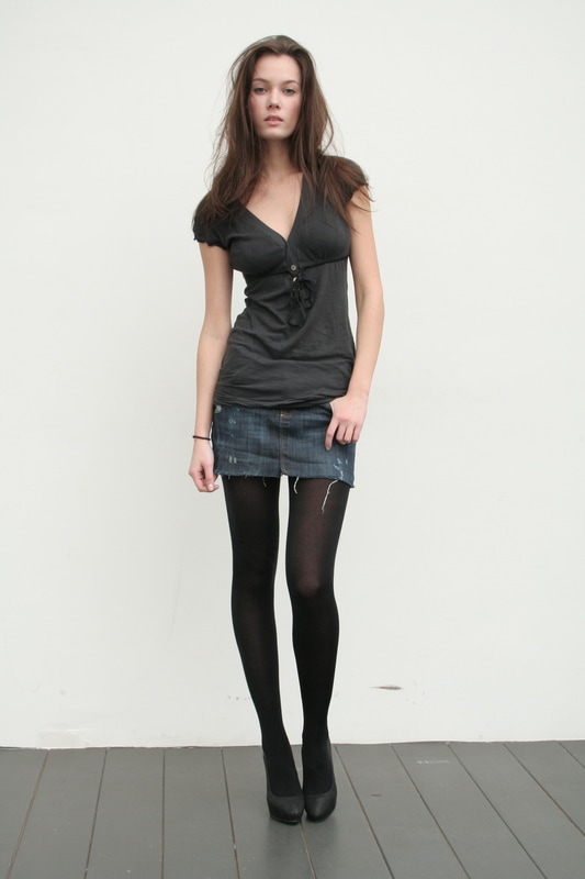
I took this photo off the St.Joes graphic design website to edit this picture by trying out to liquify it.
|
Liquify 1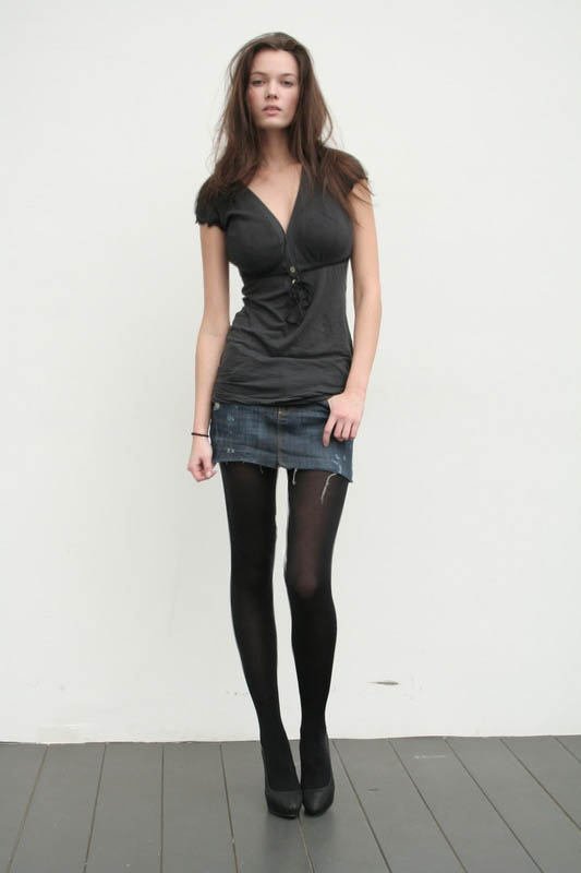
This is the first photo I tried to Liquify and I just tried to make some settle changes to get used to using the liquefying tool. I used the pinch tool and slightly pinched the sides of her waist and also pulled up her head to make her neck longer. I then Thinned out her thighs to make them a little more skinner. I then used the bloating tool to in large her breast.
|
Liquify 2
This photo I tried to make more drastic changes to trying it out the second time. I made her waist a lot skinner and I noticed that it would mess with the arms so I tried to make the arms skinny and natural looking as well. I was struggling a lot with this part but I tried to make it work as much as I could. I also tried to thin out her legs and I'm actually very proud of myself for the way they came out. I then in larged her breast but not ass much as the first picture because he waist is so small I didn't want to make her body look unnatural. I also tried to add more volume to her hair by the bloating tool.
|
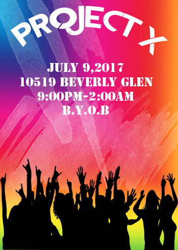
Invatation
|
This was my favorite assignment I have done yet in this class. I love the way this piece turned out and I think my creativity came out the most in this assignment. I thought of creating a invitation for a house party because I thought it would be fun to make a creative piece that can really look however I'd like. I first began by creating a colorful gradient on the background since I wanted to make it a cheerful card and make it stand out a lot. I like the background but I thought it looked a little plain and simple. So the second step was to go to the stamps and I was trying different styles and mixtures of stamps until I cam across to stamps that I added a nice texture to the background. I then put the title "PROJECT X" which is from a movie that was apparently one of the biggest parties known. So I thought it would be funny to call it that. I chose a radical font but I thought have it straight across the top would be too simple so I made it curve towards the top to give the card a nice affect. I then chose a different but similar font with the same white
|
color to write the party details in the center of the page and made the font more brighter so it can standout from the background. I then looked at the card and thought it still looked like something was missing. So I went on google and typed in "people dancing png" and found this png but in a white overlay. I chose this because I thought people dancing would replicate a party very well. So I then downloaded it and put it on my card the way I wanted to but then I thought there was too much white. So, I changed the overlay to black and enlarged the picture to fit the whole bottom of the page. Once I was done that I was very happy with the invitation and stopped there.
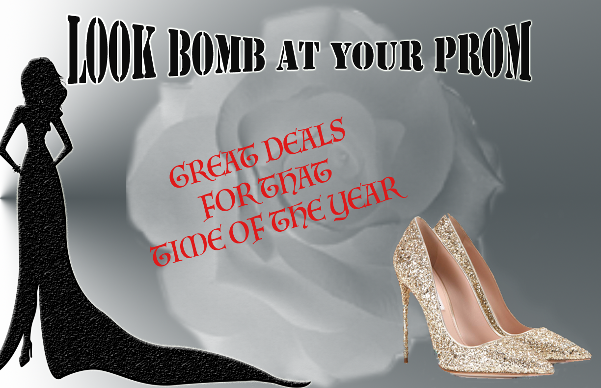
SHOE AD
At the end of the day I wasn't happy with this assignment like I wanted to be. I didn't really know where to start and what to do with this. Heels are my favorite type of shoes so I knew I wanted to work with that. When I thought of heels I thought of prom because it is prom season. So I started creating this ad by creating a grey to darker background color so everything else I out on this ad can stand out and not blend in. I then uploaded the picture of the heels and used the magic eraser to erase the background on the shoes. I then added the title and made the outline of the title white to make it pop. While editing the title I thought the background would look too simple no matter what I do to this add. So I locked the title and shoe layer in Photoshop and added a stamp of the flower in the back and made it fade a little to blend in with the gradient so that everything else can pop out on top of it. I then added the text in the middle and made it red so it can stand out from everything else. I then was trying different things to fill in the space but didn't like it. I then figured for prom only ladies buy heels so I thought of adding a picture of a girl in a dress. I went on google and found the png of the lady in the ad but it was first a cartoon character. I added a black overlay and made the texture on top of the lady more rough then smooth and I loved it. I chose that character because I knew I could edit it to take out the image and just keep the outline and have it filled in with a color overlay. If I could change this I think I would change some of the text because it look more like a prom invitation that a shoe ad.
